Navigate inside ImPAI
ImPAI’s application interface follows a unified and consistent design across all screens.
This section introduces the key interface elements that appear throughout the system, helping you quickly understand the layout and navigate with confidence.
Main Layout
The layout of the user interface is divided into three key areas:
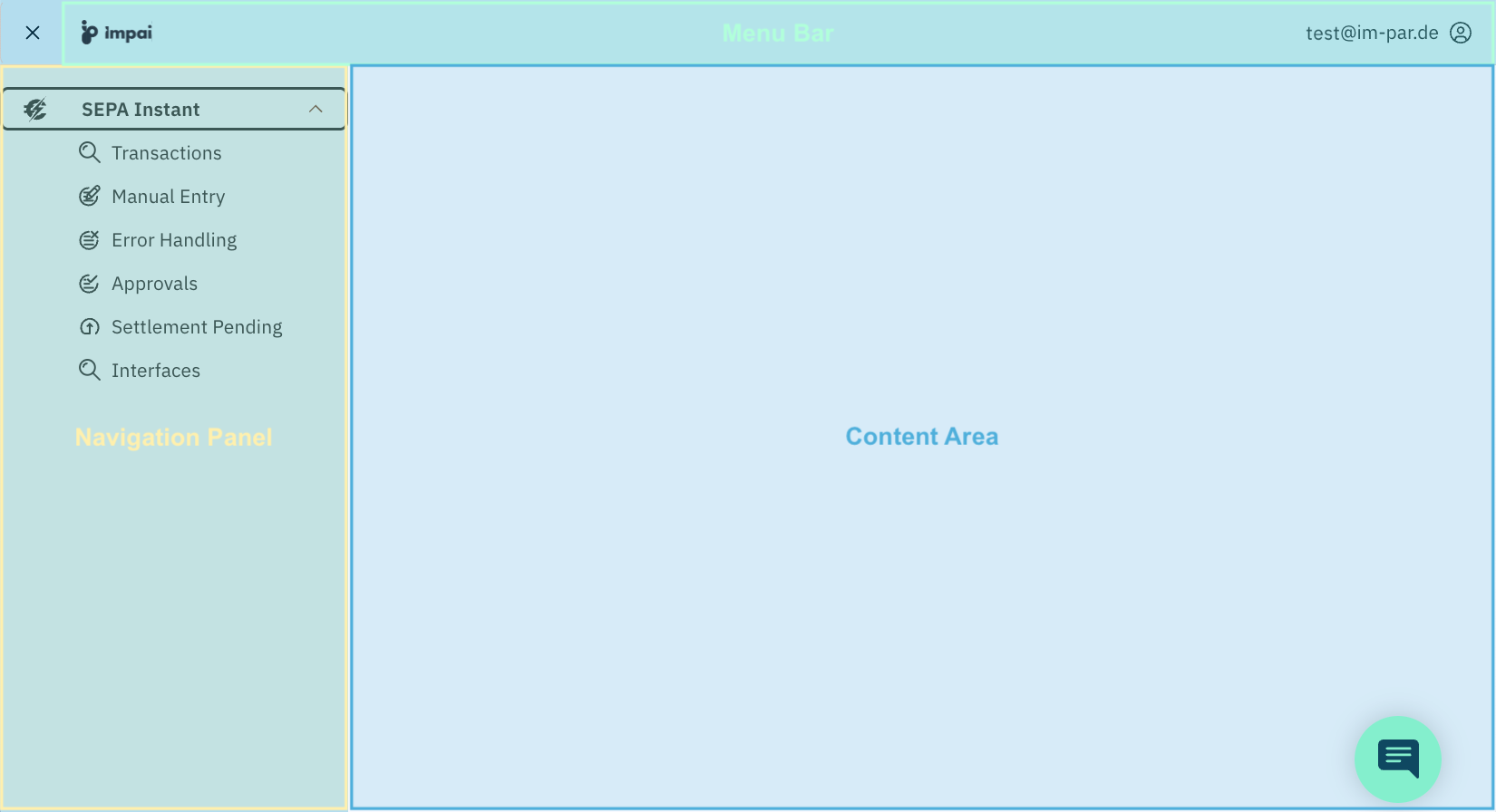
- Menu Bar (top bar) Shows additional menus and options if available for the current user.
- Navigation Panel (left side) Provides quick access to all functional areas of the application.
- Content Area (main section) Shows the actual screen information, such as Transactions, Approvals, or Interfaces.
- A breadcrumb navigation at the top of the area
Displays the current position within the application hierarchy, allowing easy navigation back to previous levels.
Example:
🏠 > SEPA Instant Payments > Transactions - A data table or form as the main content (where applicable)
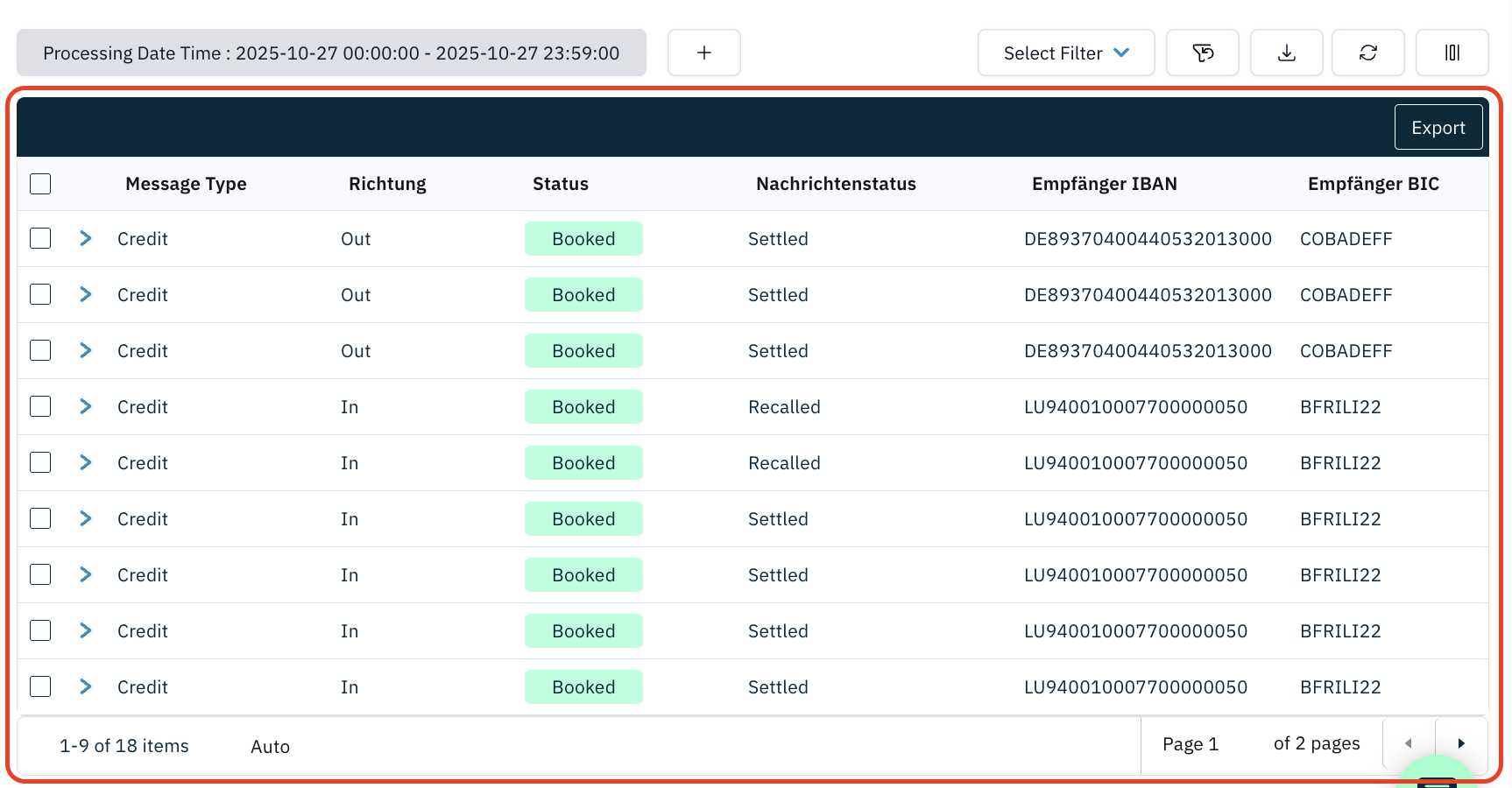
- A filter toolbar above the data table (where applicable)
- Optional action buttons (e.g.,
Refresh,Export)
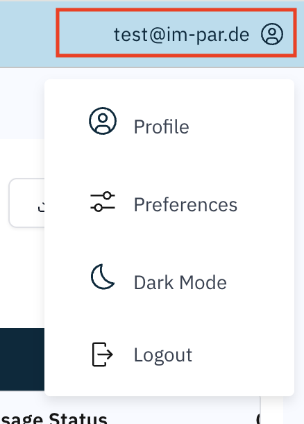
Whether a menu is visible or not is controlled by the roles and permissions of the user. At least the user menu, allowing you to set preferences and sign out, is always visible.
The user menu also includes a light/dark mode switch, enabling users to toggle between the two visual themes at any time. Dark mode can reduce eye strain in low-light environments, while light mode provides better visibility under bright lighting conditions.
Each section, such as SEPA Instant, SIC Instant, SWIFT, or others, can be opened from here with its specific screens which are listed after clicking on the icon or text label of the selected functional area. Whether an area is visible or not is controlled by the roles and permissions of the user.
This panel may be collapsed by clicking on the close icon "x" at the upper left corner of the screen.
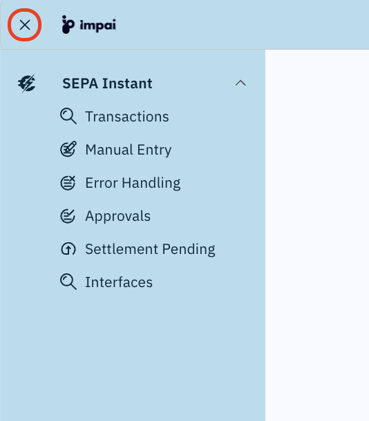
The collapsed navigation panel only shows the icons of the functional areas, so to select a specific screen you need to expand the panel again by clicking on the menu icon in the upper left corner of the screen.

Each screen typically includes:
The ImPAI user interface automatically adapts to the size and orientation of your screen, ensuring a consistent experience across devices.
Whether you’re working on a desktop monitor, a tablet, or a mobile device, the layout dynamically adjusts to provide optimal visibility and usability.
- On smaller displays, tables and forms become horizontally scrollable to keep all information accessible.
- Menus and panels collapse intelligently to save space while maintaining access to essential functions.
- All features remain available, ensuring the same functionality across all devices.
This responsive design allows users to monitor transactions, review approvals, and manage configurations efficiently — anytime and anywhere.
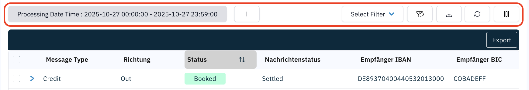
Common Toolbar Elements
Several common toolbar buttons appear on most table view screens:
| Icon | Button | Function |
|---|---|---|
| ﹢ | Add Filter | Adds additional filter criteria. |
 | Save Filter | Saves the current filter configuration for later use. |
| Select Filter | Loads a previously saved filter set. | |
 | Clear Filters | Clears all filter criteria. |
 | Refresh | Reloads the table data with the current filters. |
 | Column Settings | Allows to select or deselect the columns shown in the table. |
For a full explanation of filter handling, see 👉 Working with Filters.
Grouping of Related Messages
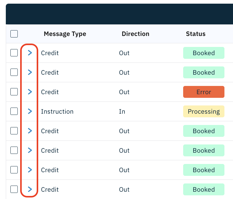
Transactions are automatically grouped under their Global Id. This is similar to how emails are threaded in an inbox: one Global Id represents a single payment flow, and all related messages (instruction, execution, confirmation, recalls, return, etc.) are nested under it.
Rows in table views representing a transaction contain multiple related messages. These rows show a small arrow icon at the beginning.
Click the arrow to expand/collapse the group and reveal all associated records.
This reveals all related messages tied to the same Global Id, making it easier to follow the entire lifecycle of the payment.
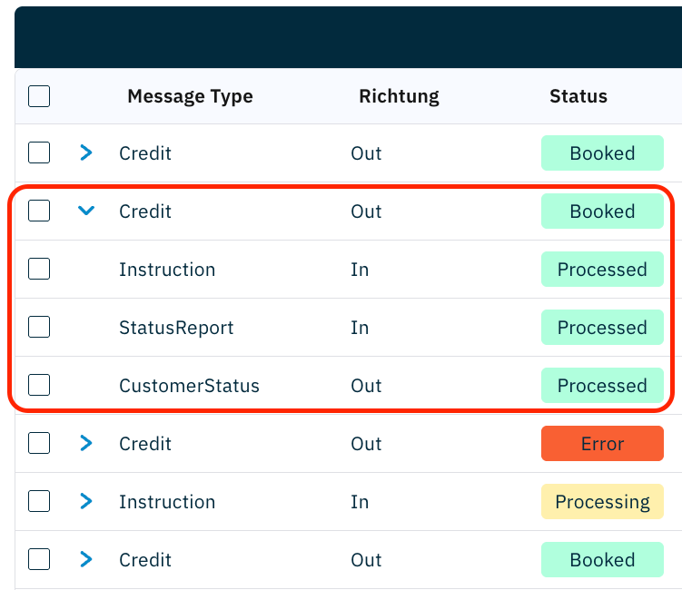
Collapse the row to return to a summarized view.
Use grouping to keep your view compact: scan the parent transaction first, then expand only when you need to see the underlying messages.
How it works
- Parent row = the business transaction (e.g., a SEPA Instant payment Credit).
- Child rows = related messages exchanged with external systems (inbound/outbound acknowledgements, confirmations, status updates, returns, etc).
- Actions like open details, export, sort, and filter apply consistently to both parent and child rows (subject to screen context and permissions).
Filters and column visibility apply to the expanded list as well. Depending on the screen, some columns may appear only at the message level.
Example: SEPA Instant Grouping
A single customer payment may appear in multiple representations as:
| Legend | |
| Outbound transaction flow | |
| Inbound transaction flow | |
- Instruction (pain.001) – Customer submits a payment.
- Credit Transfer (pacs.008) – Outgoing payment sent to ACH, or incoming payment received from ACH.
- Acknowledgement (pacs.002) – Incoming response from ACH (accepted/rejected).
- Confirmation (pacs.002) – Outgoing response to ACH (accepted/rejected).
- Customer Status (pain.002) – Status update sent back to the customer.
- Inquiries (pacs.028), Recalls (camt.056), Return (pacs.004), … – Messages optionally exchanged later.
Outbound Transaction
Inbound Transaction
- Additional messages may be related during later processing, like Recall, Return, etc.
- The types and number of related messages may differ in other functional areas.